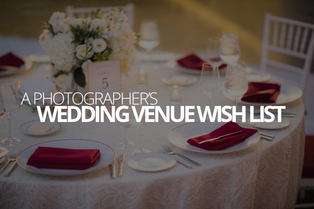
If I could design a wedding venue all by myself, it would probably just be a giant, white, slightly opaque cube, casting soft beautiful light on the nuptials from every possible angle. But, people don’t seem to want to get married in some kind of mind-dimension from a sci-fi movie that hasn’t been made yet. To many-a-photographer’s disappointment, most people choose a wedding venue because of what it’s like to be there, not just for how good it looks in photos and that’s probably how it should be.
That been said, perplexing as it may be, sometimes otherwise beautiful venues make design decisions that really suck for a photographer working there, and can really make for some seriously crappy images, especially if you have to hire someone inexperienced. So, this is the photographer’s wedding venue wishlist. Some are more important than others, but a beautiful venue that fulfills all of these wishes? You’re going to get a gorgeous set of photos.
If you run a venue and want to start seeing better photos coming from the weddings that take place there, pull out a notebook and start taking this down, or give us a call (No, seriously, it wouldn’t be the first time we’ve helped with this). On the other hand, if you’re going to be booking a wedding venue, see how many of these your first choice is checking off.
Smooth white ceilings as far as the eye can see
Photographers bounce their light around in order to brighten a scene. It makes the images they create more flattering, dynamic and natural looking. It also keeps us from having to use a continuous light source that would change the tone of the room, which is pretty important—after all, it’s tough to get people to dance when the lights are all the way up. This works best when the ceilings and walls are white, but very light, neutral colors work too, even if the walls are a darker color.
Unfortunately, all too often we’ll find venues with everything inexplicably painted in very dark or very bright colors (e.g., hot-pink). If your photographer doesn’t have light, neutral colored surfaces—especially ceilings—to bounce light off of, they’re going to have to point their light right at you (which won’t look very good), or else they’ll have to change the lighting in the room itself, which might change the mood.
Wedding isles that don’t start in a parking lot
Sometimes we’ll show up at this gorgeous wedding ceremony with a beautiful scenic view waiting to be enjoyed behind the couple as they get married, and then walk up to where the ceremony will take place to look back down the isle, and notice it just ends there with a bunch of cars.
You might be thinking that doesn’t really matter because everyone will be looking ahead at the couple who’s getting married, and you’d be right, except that the photographer spends quite a bit of time looking and capturing pictures in that direction. All of the photos of people walking up the aisle, particularly if the photographer lacks experience, are probably going to have cars in the background, which just look… blegh, in this context. Of course, a skilled photographer may realize they can capture some stunning processional photos from a side angle that excludes the cars. That is, until the bride begins to process and all the guests stand up and obscure the view; the photographer is out of options at that point and so cars in the background it is.
Trees, hedges, bushes, and more trees
Shade is the name of the game, and we want as much of it as we can get our hands on. Photographers never really know the conditions they’ll be shooting in—it could be outside and cloudy, or inside and raining, or outside and aggressively sunny… We’re going to need to make it work no matter what the conditions are, and that’s why we’re so attached to our shade. Shade, even if we don’t end up needing it, can create islands of predictability. As long as we’re outside, regardless of the conditions, we know we’ll have something to work with in a timely manner.
We also like bushes and hedges because, in addition to sometimes giving off some shade, they also give us things we can use to hide elements of the background that we might want to exclude. For example, maybe there are some regulatory signs on the property that aren’t very pretty and can’t be removed. Well, if there are bushes and hedges around, we can probably find a way to hide the ugly signs behind them and make everything—including the property—look a lot better.
Head tables away from exit signs and kitchen doors
Venues probably have a long list of reasons why they arrange the room in the ways they do, but placing the head table in close proximity to something ugly or distracting, should disqualify any proposed arrangement.
Even beautiful and very well styled venues still have to have some place for the food to come out, and regulation always requires certain signage and fixtures that can’t be removed. Obviously there’s nothing you can do about those things. But what you can do is make sure your head table, where the cameras will so frequently be pointing, isn’t sitting right next to one of them.
One venue we worked at recently was very proud of a wall feature they had installed in a recent renovation, so they arranged the head table right in front of it. Only trouble was that the wall was also the one that concealed the entrance to the kitchen, so all night long wait staff were walking out from behind that wall, directly through all kinds of photos. Unfortunately, because of the head table placement, there wasn’t anything we could do about it. Most of the photos looked good, but the head table ended up kind of looking like the worst seat in an otherwise nice restaurant.
Cake tables that aren’t smooshed into walls and corners
When the cake is cut, it’d be nice to have some photos of your faces, but altogether too often, venues squeeze the cake table as close to a wall or into a corner as they can. Presumably this decision is made to save space. Fair enough, when wait staff comes out and moves the table further into the room when it’s time for cutting. But when that table stays put, well, hey now!
Photographs of the cake cutting can be a little tricky because of the angle, and it often means the photographer’s best spot is a low angle, from the other side of the cake. That kind of angle exploration isn’t possible when the table is smooshed in there. Venues that aren’t going to move the table for the cake cutting, should arrange their cake tables with an assumption that a photographer will need some space on the far side to work.
Total freedom from fluorescent lights
I honestly don’t think much needs to be said about this. Everybody hates fluorescent light. Nobody should use fluorescent lights, unless it’s like 3am and they’re cleaning up after a bar fight. It’s not only that it’s ugly green-colored light, it’s also coming from right overhead and casting unflattering shadows, and exposing every detail of the people and environment. Of course, ball rooms and ceremony halls usually have nicer lights, but I think even bathrooms and hallways should have pretty, ambient lights, instead of the harsh soulless fluorescent ones.
LED’s and incandescents feel warmer and more intimate, and it gives us photographers something to work with that has some character of its own.
How many of these did you venue get right?
Did you already get married, or already book your venue? How many of these wishes are going to come true for your photographer? Connect with us on Twitter or Facebook and let us know!

